case study
Saudi Icon
Web Design & Development
Design
Branding
Strategy
Jul 11, 2024The Revamp: Reflecting Impactful Changes on the Brand Identity
As the company was broadening its horizons from fit-out to design and build, a reflection on its brand identity became inevitable. Saudi Icon is actively playing a bigger role in the creation of meaningful new building structures and the shaping of cityscapes and convivial spaces in the Kingdom and in the region. That means that there is a shift in how they present themselves to clients and partners, in the structure of their internal team, in how they manage operations, etc.
And all of this had to be apparent on the outside, in how Saudi Icon looks and communicates to the rest of the world.
So the process of revisiting the brand identity began... first with a strategic exercise.
Let’s circle back to the positioning statement:
FOR business owners, real-estate developers and government entities, SAUDI ICON is a design & build company OF honest builders who are solution oriented, from inception to delivery, BECAUSE people deserve spaces where they can create happy universes.
Business owners, real-estate developers and government entities…these are big guns that need not only to be impressed by their chosen design and build partner, they need to genuinely trust them. >
And the promise of a happy universe is no small feat.
Accordingly, Saudi Icon’s new identity needed to reflect:
- Strength
- Originality
- Credibility
- Charisma / Magnetism
After research, a few design directions were explored, and the result was:
A simple play on typography was applied while delivering a strong allure with the S and the I standing tall next to one another. To compliment this modern and robust typeface, a square dot was proposed on the I but not symmetrically over the I, just a little off to the right, giving it its own space somehow while it completed the initials. The color palette harmonized the identity with the usage of a sophisticated hue inspired by emerald green and a very discerning red hue for the dot.
A dot. Such a simple graphic application yet with so much visual impact and meaning. We wanted to take the dot further than just being a spot that “dots” the I. This dot is a “ full stop, period or full point. It is a punctuation mark. It is used for several purposes, most often to mark the end of a declarative sentence; this sentence-terminal use, alone, defines the strictest sense of full stop.”
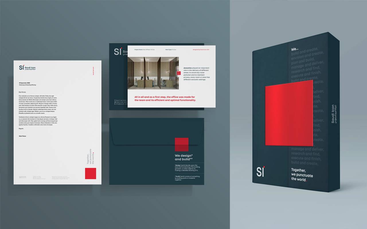
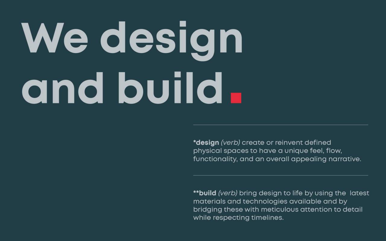
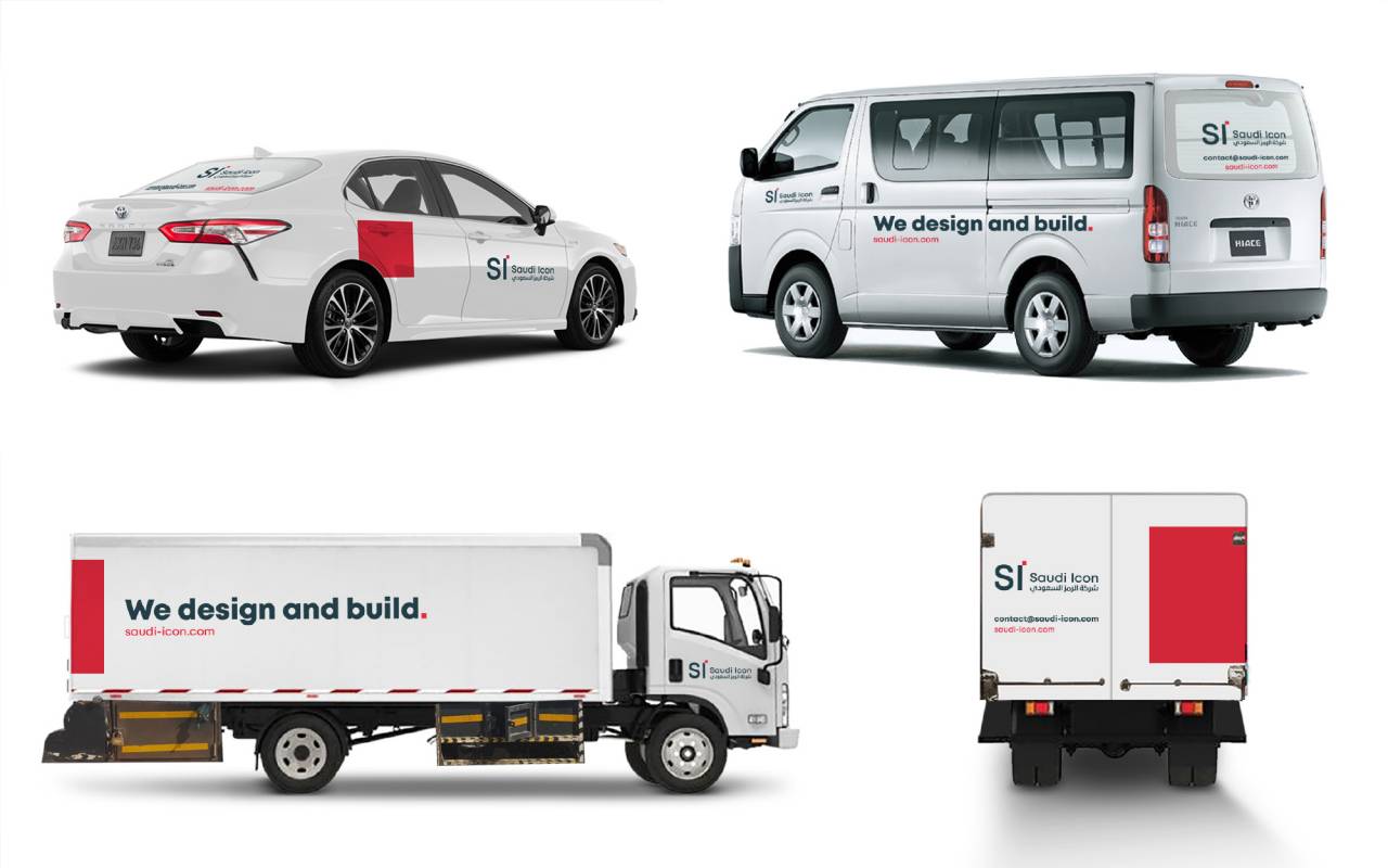
The first usage of this punctuation mark came with the launch of the “We / And” campaign. We design and build was the first declarative sentence Saudi Icon began using across its communication collaterals to put forth its new mission. Of course, it was punctuated with a period: We design and build. Period.
To push the envelope further, Saudi Icon thought of proposing its own definitions to terms like “design” and “build”, to really unmask these words from generic industry meaning and simply make them their own.
We design* and build*.
*design: envision and plan happy universes.
*build: execute and bring to life happy universes.
What is intrinsically simple yet so definitive here is that the dot, i.e. period, is not going anywhere. It is literally punctuating everything that Saudi Icon does.
As such, Saudi Icon is intensifying its raison d’être by giving deeper and new value to their mission, by removing the commoditization of industry-related terms, by creating an architecture of meaning and by leaving a very distinctive mark on what they do.
Let’s take it one step further one more time. They say it takes a village and Saudi Icon is no exception. Each department brings its own value to each and every project Saudi Icon undertakes.
Engineering: We plan and build.
Architecture: We envision and create.
Project Management: We manage and deliver.
Procurement: We research and find.
Construction: We execute and finish.
What does this mean?
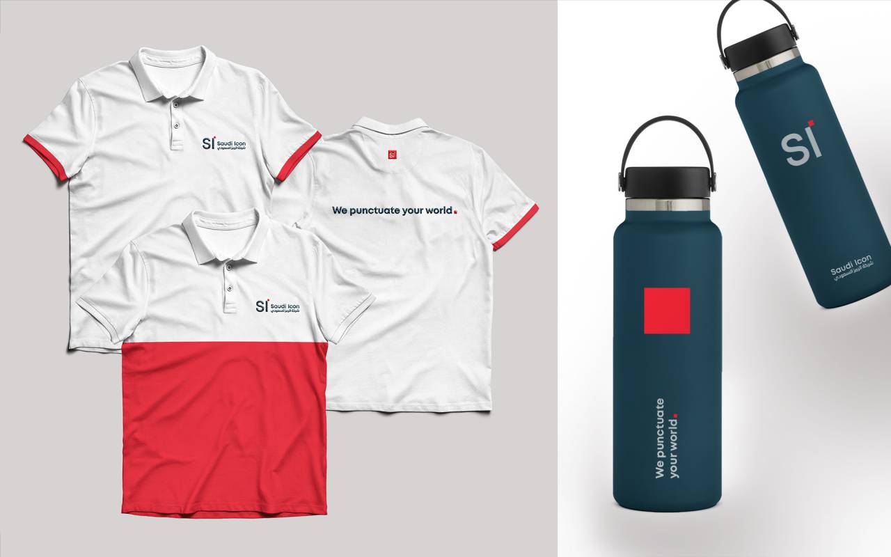
Saudi Icon
We punctuate the world
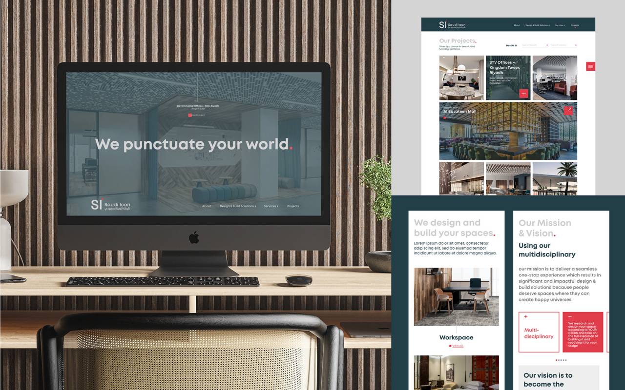
You can visit their website here to learn more.
- Collaborators
Katia Abou Rizk Barakat (Brand Strategy)
Elyan Jabre (Brand Identity & Website)
Christine Hajjar (Lead Designer)
Alphonse Aad (Graphic Designer)