case study
Multi. Confidential Projects
Design
Strategy
Oct 4, 2023Design is not ONLY about aesthetics, it’s functional
If you’ve been following our updates, you know our Case Studies usually feature a specific work for a specific client while highlighting a few key ideas about that project.
During the years, we’ve had projects that we simply couldn’t share due to their confidential nature. But we’re just so damn proud of them! We just had to share.
We also noticed a common theme across these projects which was related to functional design. The basic idea here is that the general impression of design is to make something look pleasant. But it’s more than that. This can be debated but we’d like to say that that would fall under Art.
Art is about aesthetics while Design is about purpose.
And when you come to us, you’re not coming for art. You’re coming to achieve a clear objective; and that’s where design comes into play.
The objective:
The common objective among these businesses that approached us was in the constant pursuit of building easily usable products, services, and communication material. There was always a plethora of new features, new technologies, and advanced capabilities. And these had to be displayed in a manner that made it effortless and almost intuitive to know how to consume or use.
And more often than not, making it simple is the hardest thing to do.
So how can we achieve simplicity along with functionality while being thoughtful about the content?
The need to understand and dissect information: (designing a tech pitch presentation)
Before designing or redesigning the information, we had to establish the core messages. This usually comes easily from the knowledge of the brand or what it’s trying to say. However, when the project is using industry-specific terminologies and complex business terms, it is our job to familiarize ourselves with the lingo and turn it into a functional design to serve the purpose at hand.
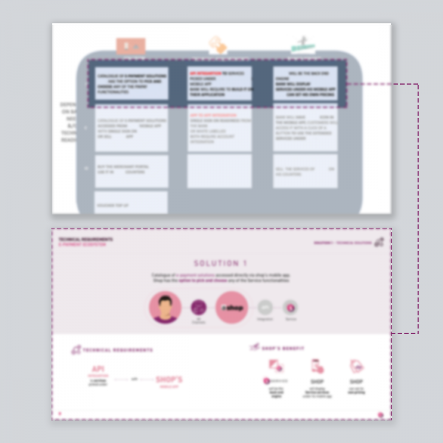
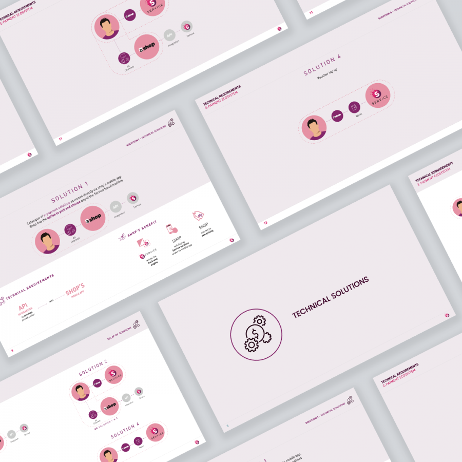
A mobile payment app asked us to do a presentation to help them pitch their offering to potential clients. There were a number of scenarios they were attempting to portray via typical PowerPoint chart elements. It just wasn’t working, it was too complex for text alone.
We had to dig deep and properly understand the scenarios to be able to visualize them via diagrams and schemas. The visuals used are an effective way to simplify complex messages since our brains process visuals faster than words. The messages now make sense to both the presenter and their audience. The slides end up facilitating the presentation and the flow.
See anonymized before and after samples below.
Flexibility and trust from the client to translate data into a meaningful format: (multi-faceted entity)
The majority of products that we design are focused on a lot of data that the user needs to make sense of in order to efficiently carry on with their task.
There are so many products and websites that try to do so much for so many audiences, everyone tries to be the Swiss Army Knife of the industry. Therefore, if you want your product to stand out and be simple, you need to define a core value and identify who this product is really for.
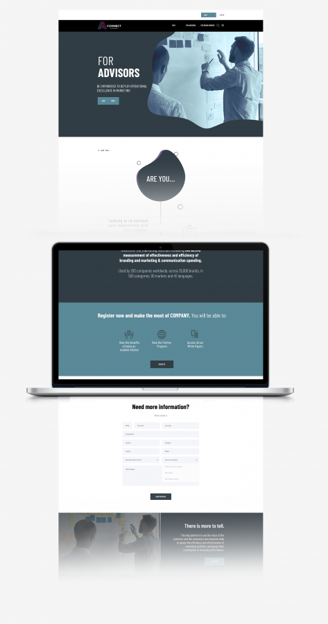
That's why this entity (anonymized on purpose for confidentiality) left us with the flexibility in doing the necessary website structure with their content. Their website was stripped to its raw essentials in order to emphasize functionality while thoughtfully reducing their content. We also took a teaser approach to the content leaving the rest of the information to be shown on demand to attract the audience to register as even the data was too confidential to be left publicly.
Everything we design should revolve around serving a purpose or solving a problem: (time logging tool)
The products we are using can be complex but shouldn’t seem complex. And we need a critical design eye to break apart that complexity for the user and put it in a flow that they can engage with. This is more accurately tied to the concept of user interface (UI) design.
This business provided us with a basic Excel-like interface for employees to log in their media budgeting plans. We broke their basic dashboard down, and transformed it into a clear interface that organizes their complex elements in a simple way; making the whole experience for their employees seamless and intuitive to use.
We used a consistent vibrant color palette throughout the design to guide the eye and keep the users engaged.
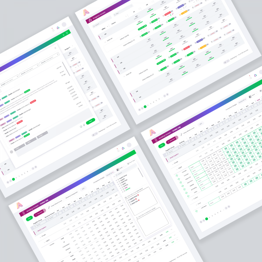
The same line of thought applies for another project for this business, a Timesheet Approval Module, where employees log in the time they spend on each project. This time we had to design the dashboard interface from scratch.
First, we started with the content, information hierarchy & jobs to be done. Whether it was navigation or shortcuts, information visualization, or anything that needs users’ immediate attention...
Next came the wireframes, layouts, and data visualizations, and the most exciting step: the visual design to let the numbers and content gracefully stand out on their own and serve the users’ functional needs.
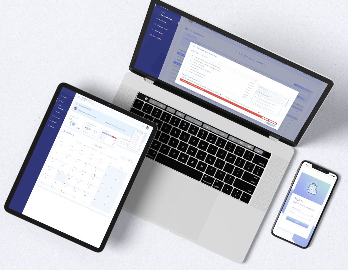
Regardless of the task at hand, the design has to be functional and this is a core idea that drives our work.
- Collaborators
- Lilas Ghalayini (Design Team)
- Wadih Antoun (Digital Strategy)