case study
Wyndham Kellett
Design
Feb 10, 2023A visual program that reflects the right style & emotions.
Wyndham Kellett is a construction management consultancy created in 2019.
After creating its business plan, an identity - or to be more precise - a logo was developed to represent this new company. Then different collaterals were being handled separately without maintaining a specific feel or consistency which reflected poorly on the brand.
A brand is not just a logo and that's what we came into the project to help with. To develop a brand. We started with defining the brand strategy in order to understand the business in all its details. Through all the research and applied frameworks, we decided together with the client on a niche where Wyndham Kellett could exist and excel in.
This strategy and niche was our compass to determine and guide the visual language: mature & classic look that reflects an authority in its field.
These simple yet powerful words had to be visually translated to all the brand's aspects.
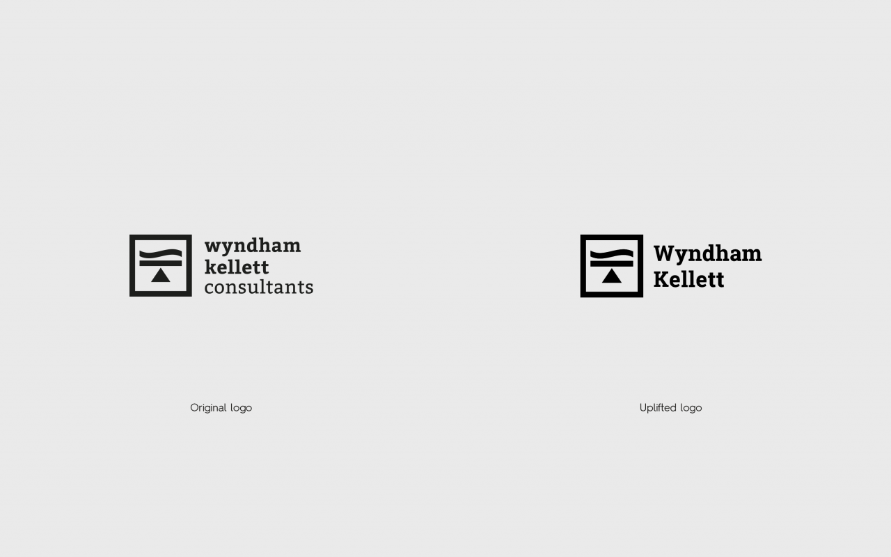
Accordingly, the logo was minimally uplifted: capitalizing the first letters of each word and removing the word consultants to showcase more authority.
What followed was the development of the visual language: typography, color palette, photography style, all came together to maintain consistency and to reflect the style & emotions needed.
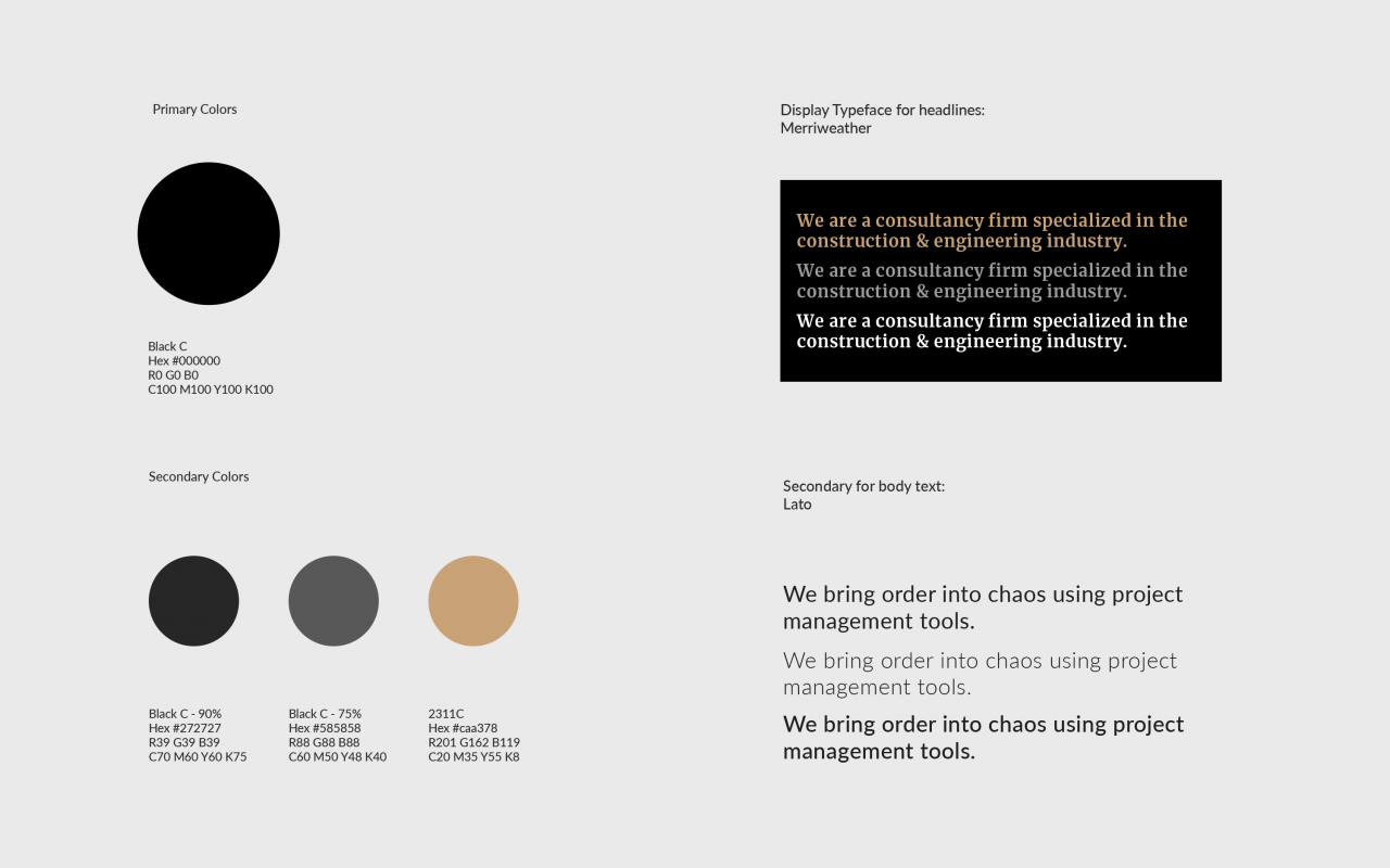
An extensive photo library was created as well. Dark colors, dramatic effect, gray tonalities with a hint of amber to make sure all the elements are well thought of and coherently worked together.
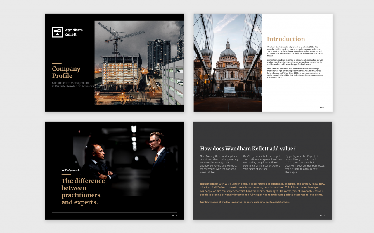
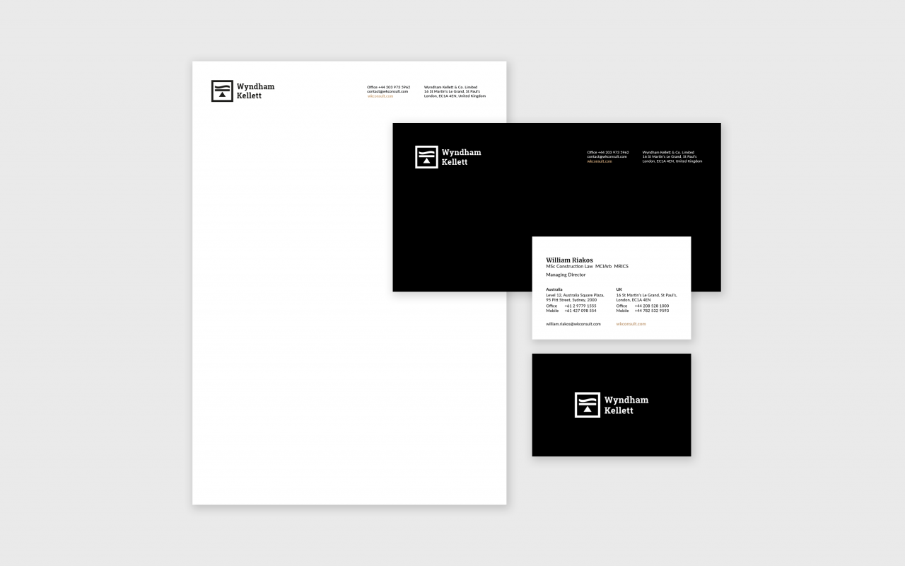
These visual guidelines were implemented on all
the brand's collaterals to create a seamless experience backed up by a clear
rationale.
We’re continuing our journey with Wyndham Kellett
by launching their digital marketing efforts to help drive traffic to their
website, and ultimately generate leads.
- Collaborators
Elyan Jabre (Brand Strategy)
Lilas Ghalayini (Design Team)
Wadih Antoun (Digital Strategy)