case study
Spearhead
Strategy
Branding
Feb 26, 2020When it’s time to reflect on who you are
There is an Arabic saying "السكافي حافي" about how a shoemaker is barefoot - meaning you never get to tend to yourself with what you actually do for your business. And it just didn't seem right anymore.
We've been feeling the urge to tend to our identity as Spearhead for a while and the country's circumstances was just the push we needed. We decided to act upon this, to improve ourselves, to better define our offering after the past 7 years and try to be positive and keep on pushing forward.
Our brand identity was simple, modern and mostly black & white. Over the years we've experimented with using real-imagery and illustrations. At some point, we decided to incorporate colors to make our official documents and presentations less dull and printer friendly (that happened to be a good thing for the environment as well).
What we wanted was more than just fixing our visual language. We wanted to align our business strategy with our brand and core values & culture. That's why our search started with internal sessions, with all of our team members to discover what it is that truly makes Spearhead after these years. So we dug deep and brought forward our mission, vision and core values. It was really a true team effort - Spearhead is a combination of all those who have helped shape it, both existing and previous team members.
Now that we were aligned on the core pillars, it was time to translate it into a visual language.
We love our identity and we didn't want to compromise on our ’footprint’, but our branding elements were fragmented and needed a proper uplift. We made some minor modifications to the logo, some shaping and finessing.
Then, we addressed color & typography and explored several directions till we landed to the place that felt right: simple & witty with an edge. We made a conscious decision to look a bit different than what people might be expecting.
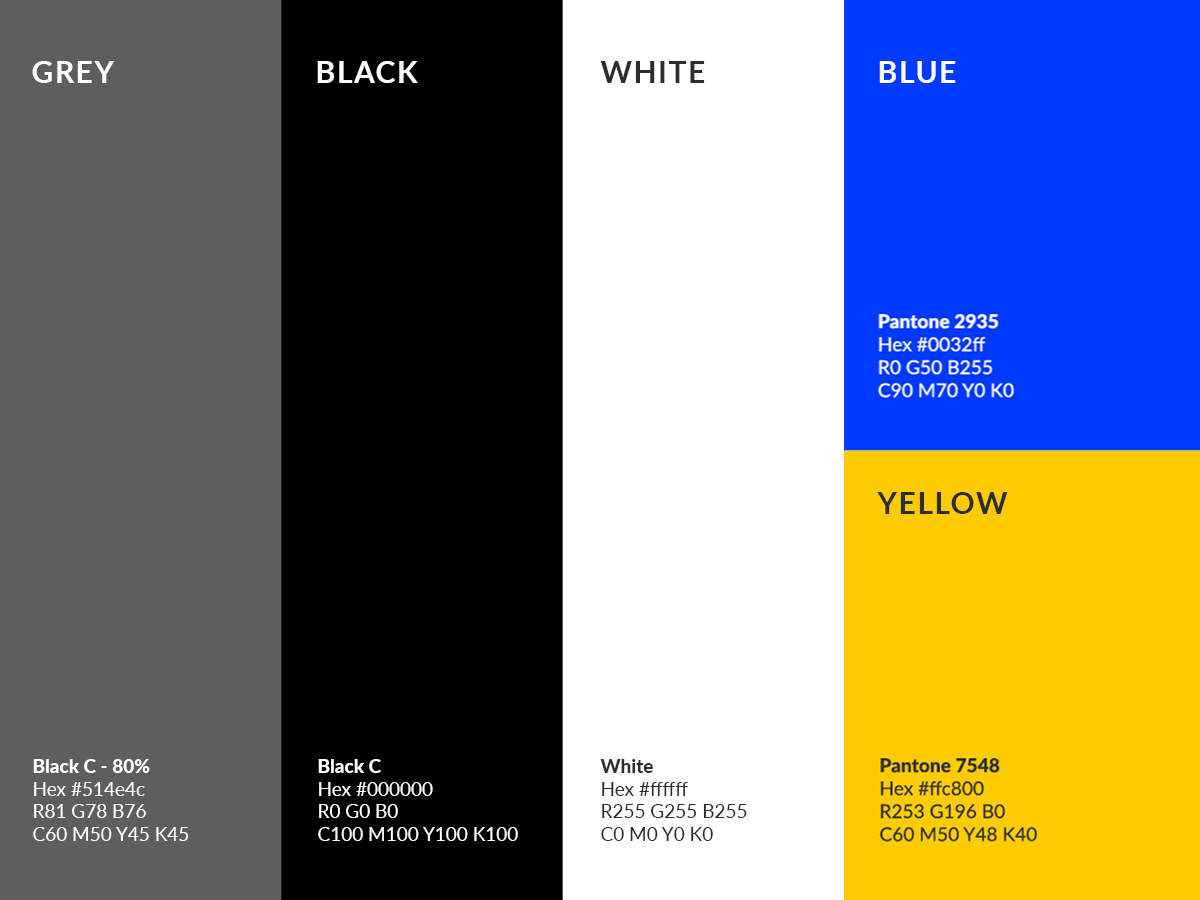
The witty edge was brought forward by the choice of color: yellow and blue. Basing ourselves on a subtractive color mixing system, we made these 2 basic colors more interesting. Whenever blue is highlighted with black or white, the text turns yellow and vice versa (try it, highlight this paragraph and see!). Et voilà, our visual style was born!
Type was there to compliment this play on color. We opted for a modern sans serif family to emphasize our modern look and maintain the simplicity and neatness.
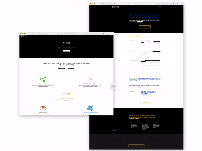
It's also not just about maturing visually; we're much more skilled and focused in our offering. Our website had to evolve to tell our story better.
We rethought about our structure and the core messages we wanted to highlight without forgetting some technical aspects to help search engines and our digital ads score better. The result was a website built with laser focus on key objectives.
We wanted the visitor to feel that we're not your typical agency which only cares about design and the visual work. We're about employing all available tools to get you to your objectives. We're rational creatives. And more importantly we wanted to guide those interested in knowing us and educating them towards finding the next step with their brand. Even if they're not looking to commission us for work, our new Process page will guide them through the marketing journey for their business.
Feel free to explore it and learn more about our culture, what we do and how we work. And if you feel like learning, visit our blog.
Overall, we think we are now better represented and very excited to share our improved self with you!
It's still us, but better!
- Collaborators
- Katia Abou Rizk Barakat (Marketing Strategy)
- Wadih Antoun (Digital Strategy)
- Elyan Jabre (Creative Director)
- Lilas Ghalayini (Design Team)
- Rola El Ayoubi (Design Team)