case study
Olio & Soto
Strategy
Social Media Management
Design
Branding
Strategy
Challenging brief. Unconventional solution.
Being commissioned to rebrand, uplift, or create an identity is very common in agency life.
Then, once in a while, a really challenging brief comes along; it tickles our neurons and makes us dig deeper, in this case into merger strategies, and delve into unconventional solutions (and we like when this happens!)
That's how we felt when we were approached by Olio and Soto: excited and eager...
Olio & Soto became one: Japanese and Italian under one roof. Though their respective locations were always side by side, the new business strategy was to tear down the wall that separated them, take the best from each world and merge them into one inviting environment.
The requirement was for us to communicate this in a bold fashion without taking recourse in the simplest and most obvious solution, i.e. full rebranding. At the end of the day, these entities have been around since 2002, meaning we can build on their brand equity. So, the objective was to achieve impact with minimal rebranding and collaterals' printing, while still achieving strong visibility.
Then we stumbled on this:
"Study after study puts the failure rate of mergers at somewhere between 70-90%." - Harvard Business Review
We realized that in order to make this merger a success, we have to quickly build on the past and form a compelling new future, one that stands out confidently.
Challenge accepted!
The communication of this merger was in no way to be safe and lackluster.
Having this in mind, we opted for an effortless, non-conformist and sort of messy visual style that reflects the merger of two very unique entities.
The merger campaign revolved around the tagline "Stuck on you".
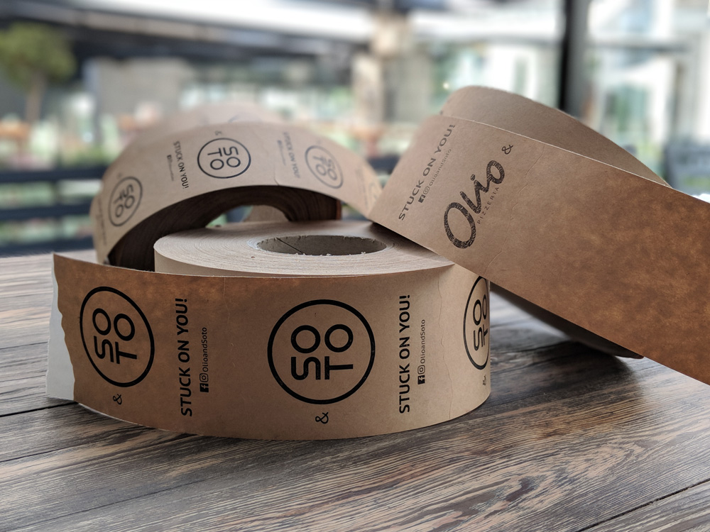
What does this mean? Basically that these two can't stay apart and more to the point that they just keep getting closer! What else? That this new unified entity will be stuck on you, yes you! The new offering is just that good!
The literal tagline really drove the visual style. The logos will be stuck on each other in a duct tape style on all collaterals: menus, delivery packaging, uniforms, flyers.
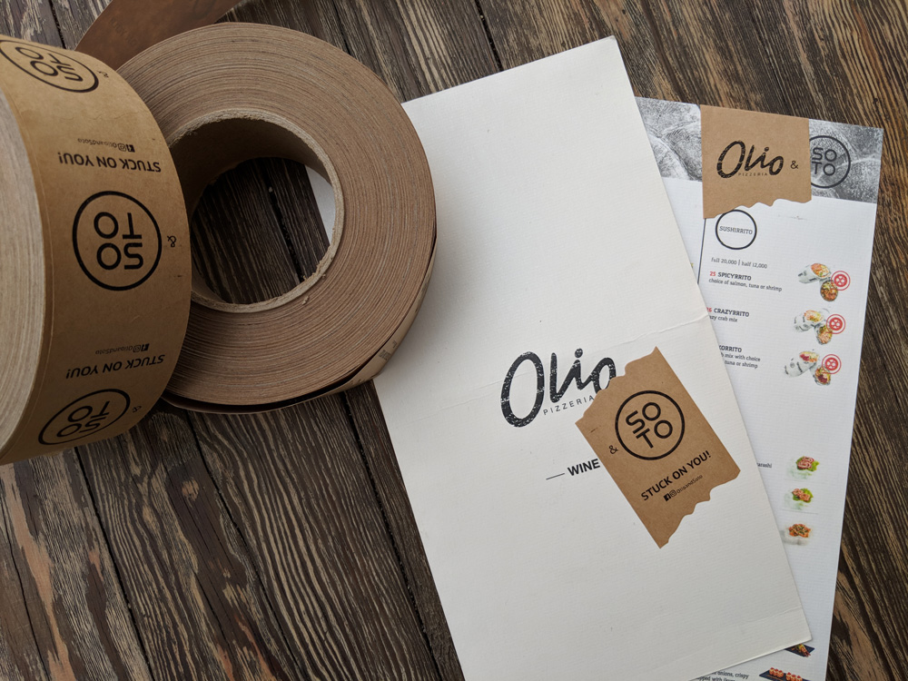
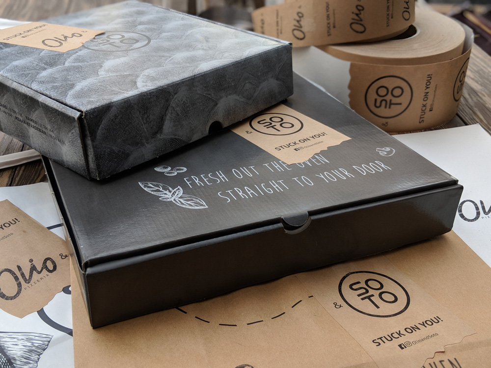
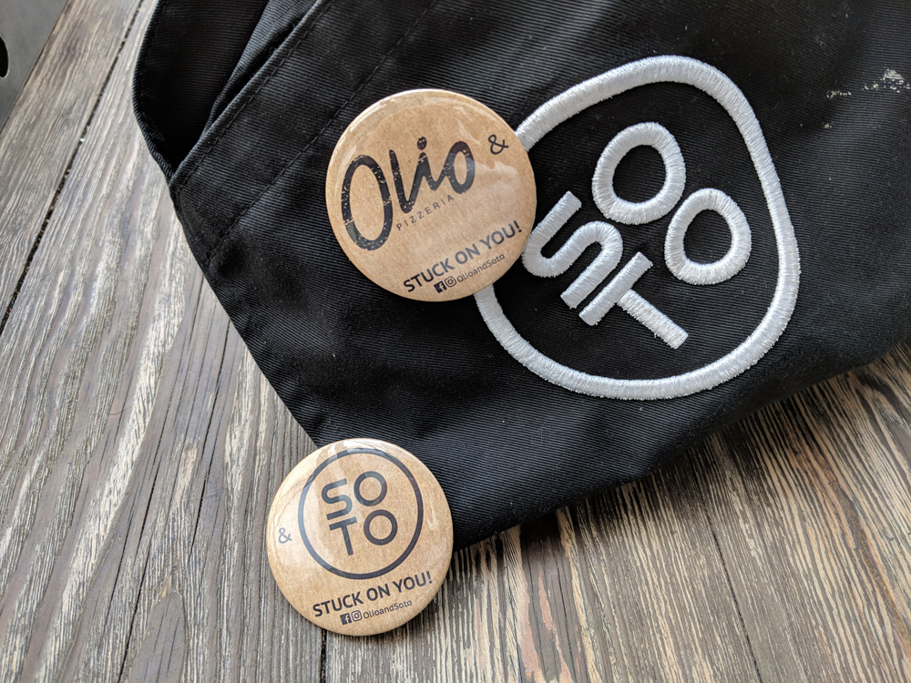
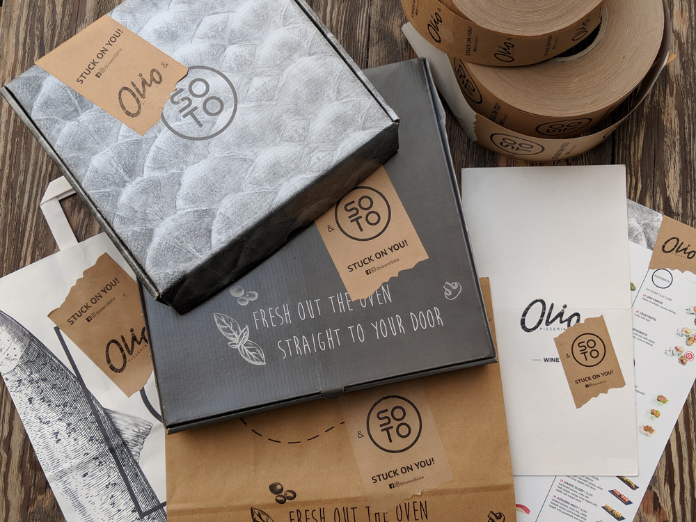
Production cost: minimal! Impact: maximal!
The merger will be communicated in-house, on delivery materials and online through the merger of the social media pages (Facebook & Instagram) and a landing page TogetherWeMakeSense.com to communicate the merger to old & future fans.
Amore amore amore… kids cover your eyes! Happy Valentine's Day! #TogetherWeMakeSense #StuckOnYou
Posted by Olio & Soto on Tuesday, February 13, 2018
No need to have Italian and Japanese on separate nights anymore because Together they DO Make Sense!
- Collaborators
- Katia Abou Rizk Barakat (Marketing Strategy)
- Wadih Antoun (Digital Strategy)
- Elyan Jabre (Creative Director)