case study
BL_NK
Design
Branding
Strategy
Dec 16, 2025A functional beverage designed to help people work better.
The Ask
When the founder of BL_NK approached us, he came with a name—and a vision.
He wanted to create a new category of functional beverages for the workplace: a clean, focused alternative to coffee and tea, designed specifically for corporate teams seeking better energy, productivity, and cognitive clarity.
But this was not just another energy drink.
This was a brand rooted in purpose.
A brand meant to support neurodiversity, inspired by the founder's own journey with focus and ADHD.
A brand that would enter the competitive UK market with a clear mission: Help people work better.
Our mandate was to develop the full brand strategy, define a distinctive positioning, and craft a visual identity that could stand confidently in the corporate world—premium, minimal, and deeply meaningful.

The Discovery
As we dove into the competitive landscape—ranging from energy drinks to nootropic and functional beverages — it became clear that the category was loud, vibrant, and overwhelmingly youth-oriented.
Most of the brands were not tailored to the corporate environment.
This revealed the gap we needed to fill:
A functional drink built for the mind. A brand for professionals. A product that supports focus, productivity, and well-being.
The Challenge
We were building a brand for two worlds:
1- A competitive UK beverage landscape with strong incumbents and very loud aesthetics.
2- A corporate environment where professionalism, subtlety, and trust matter more than trends.
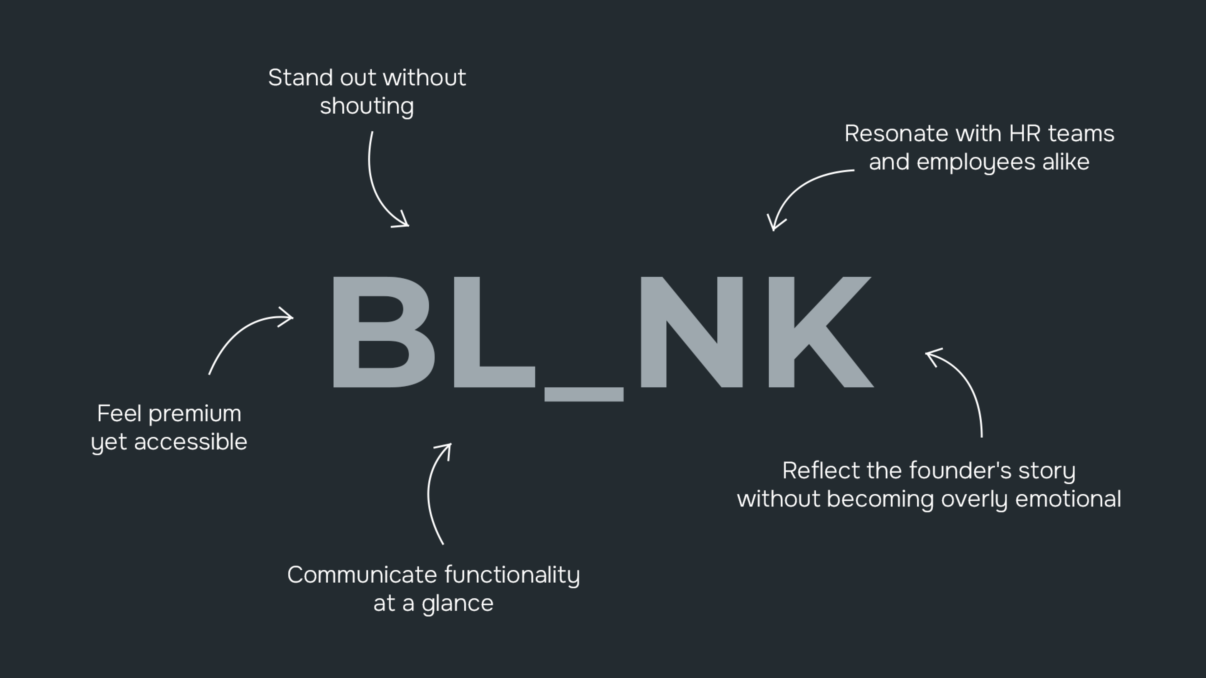
We needed a visual identity that could:
- stand out without shouting
- feel premium yet accessible
- resonate with HR teams and employees alike
- reflect the founder's story without becoming overly emotional
- communicate functionality at a glance
And most importantly, it needed to bring the meaning of the name BL_NK to life.
During our initial review, we identified a critical barrier in the original name. The brand was first presented as “BLXNK,” a spelling that looked modern but proved unreadable and confusing for most people. As part of our strategic refinement, we simplified the name to “BL_NK,” creating a clearer, more intuitive identity while preserving the symbolic ‘blank space’ at the heart of the concept.

The Rationale
A Strategy Built on Purpose.
We anchored the brand in three pillars:
1. Elevating Workplace Performance
Helping teams achieve better focus, energy, and productivity.
2. Minimalist, Science-Backed Quality
A clean, honest product with transparent benefit communication.
3. A Social Purpose for Neurodiversity
Raising awareness and supporting individuals who think differently.
This strategic foundation guided every visual and verbal decision.
A Visual Identity That Makes Space
BL_NK needed to embody clarity—literally and metaphorically.
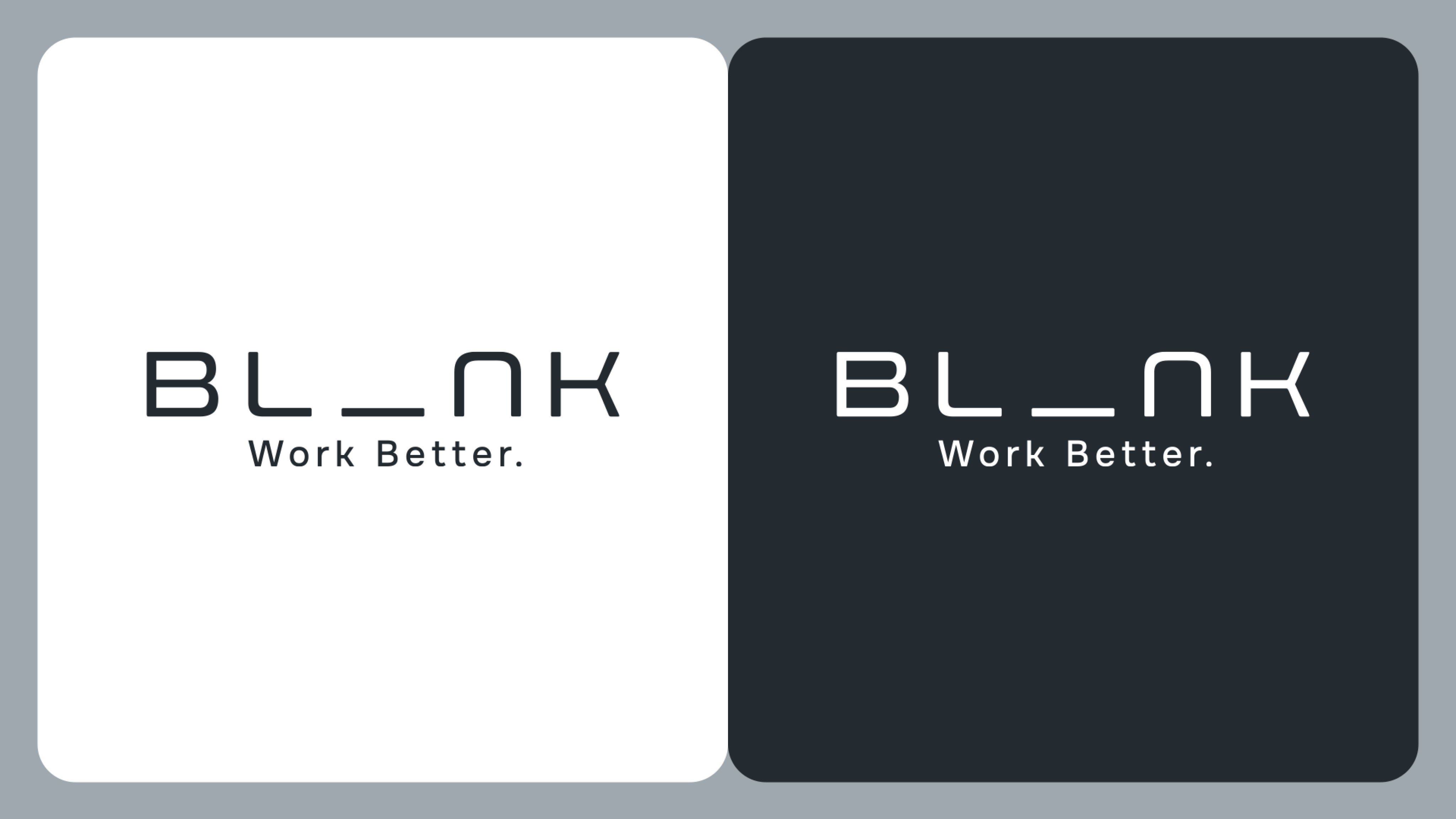
Logo — The Power of the “Blank”
We designed a cubic, minimalist typographic system where the dash between “L” and “N” creates an intentional empty space—a visual pause.|
A subtle nod to the blank state of mind the drink aims to enable: calm, focused, ready.
Tagline — Work Better
Direct, confident, and aligned with the brand’s core promise.
A message any corporate client can instantly relate to.
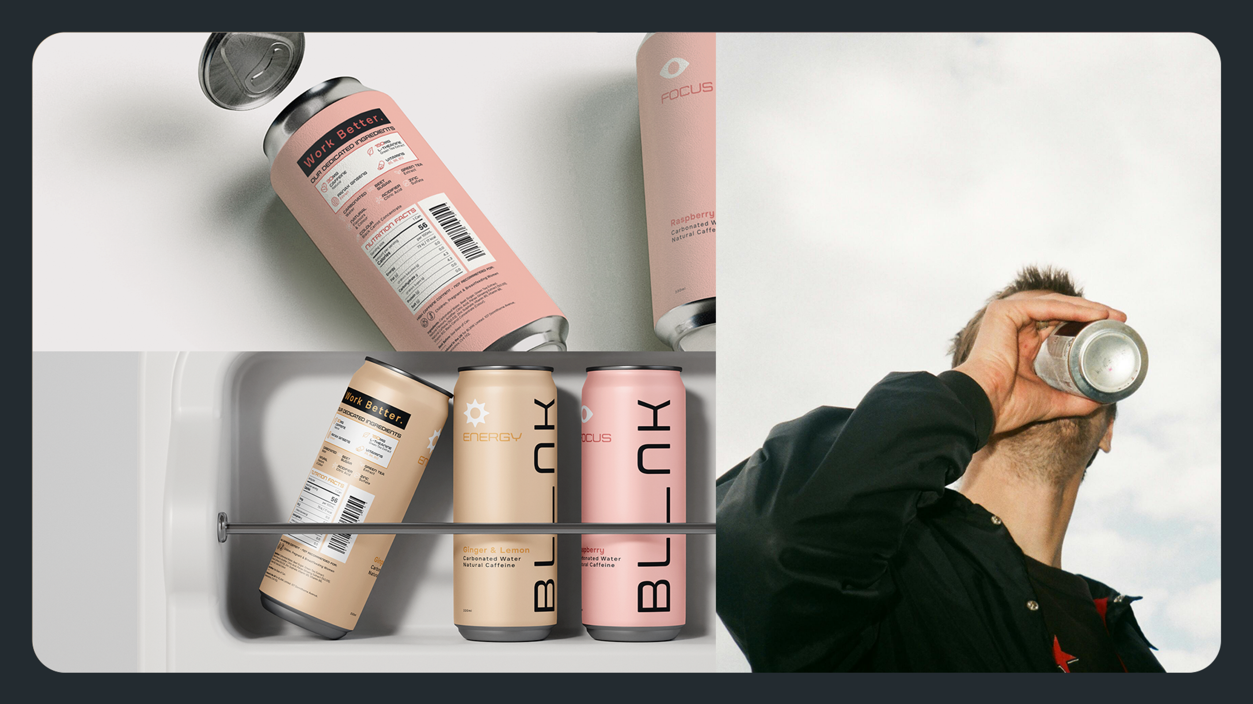
Color Palette — Soft, Premium, Non-Distracting
Unlike most functional drinks filled with neon and intensity, BL_NK needed to live comfortably on a corporate desk.
We created a pastel palette inspired by the flavors, muted, not vibrant, soothing, not stimulating, a palette reflective of a brand built for clarity
Each flavor has its own tone, but all remain within a premium, quiet world.
Iconography — Clear Functionality, Minimal Form
To communicate benefits instantly, each functionality received its own geometric icon:
- Focus → Eye
- Energy → Sun
- (and any future functions can follow the same system)
Clean lines, consistent geometry, and a visual language that feels both modern and corporate.
![]()


The Outcome
BL_NK emerged as a brand with a distinct presence and purpose:
- A strategy that carves a unique space in the UK market.
- A minimalist visual identity that speaks directly to corporate environments.
- A logo that embodies clarity, presence, and the founder’s personal story.
- A color and icon system that makes functionality intuitive and elegant.
- A brand that supports focus, productivity, and neurodiversity in equal measure.

BL_NK isn't just a beverage. It’s a workplace ritual.
A moment of clarity. A tool for teams who want to work better.
- Collaborators
- Christine Hajjar (Head of Design)
- Elyan Jabre (Creative Director)
- Katia Abou Rizk Barakat (Marketing Strategy)
- Yasmina Mortada (Senior Account Executive & Project Manager)