Case Study
VIDA
Branding
Jul 21, 2026A Brand Built to Last
VIDA was founded to deliver premium interior fit-out solutions for luxury hospitality projects across Saudi Arabia. Before entering the market, the founders wanted a brand that would immediately communicate quality, sophistication, and credibility to hotel developers and hospitality partners.
We created an identity that reflects the same principles behind VIDA's interiors: timeless, refined, and meticulously crafted. The logotype combines fluid, elegant letterforms with a contemporary aesthetic, creating a distinctive mark that feels both premium and enduring. Its soft transitions and balanced proportions echo the harmony between architecture, craftsmanship, and the human experience within a space.
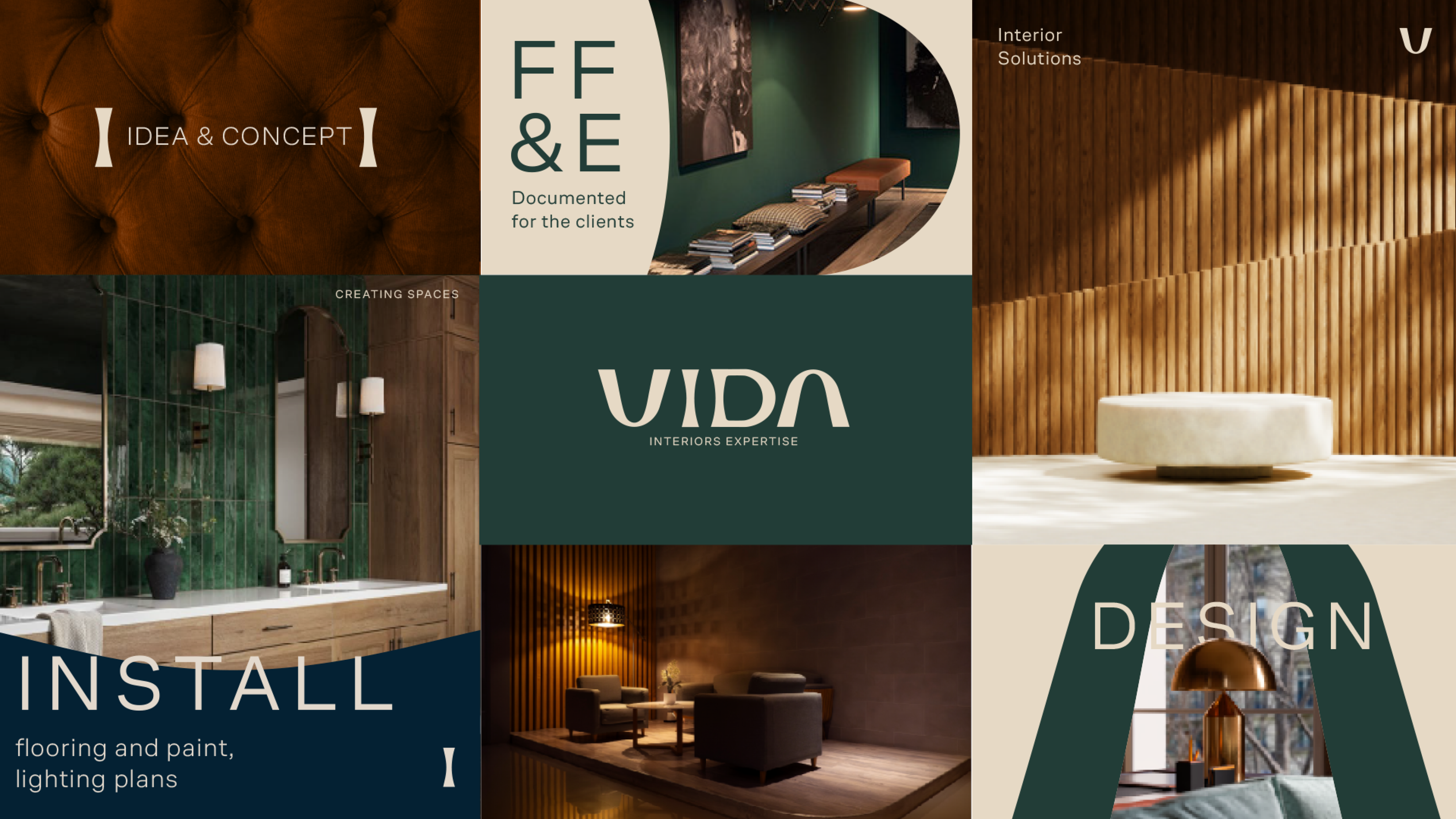
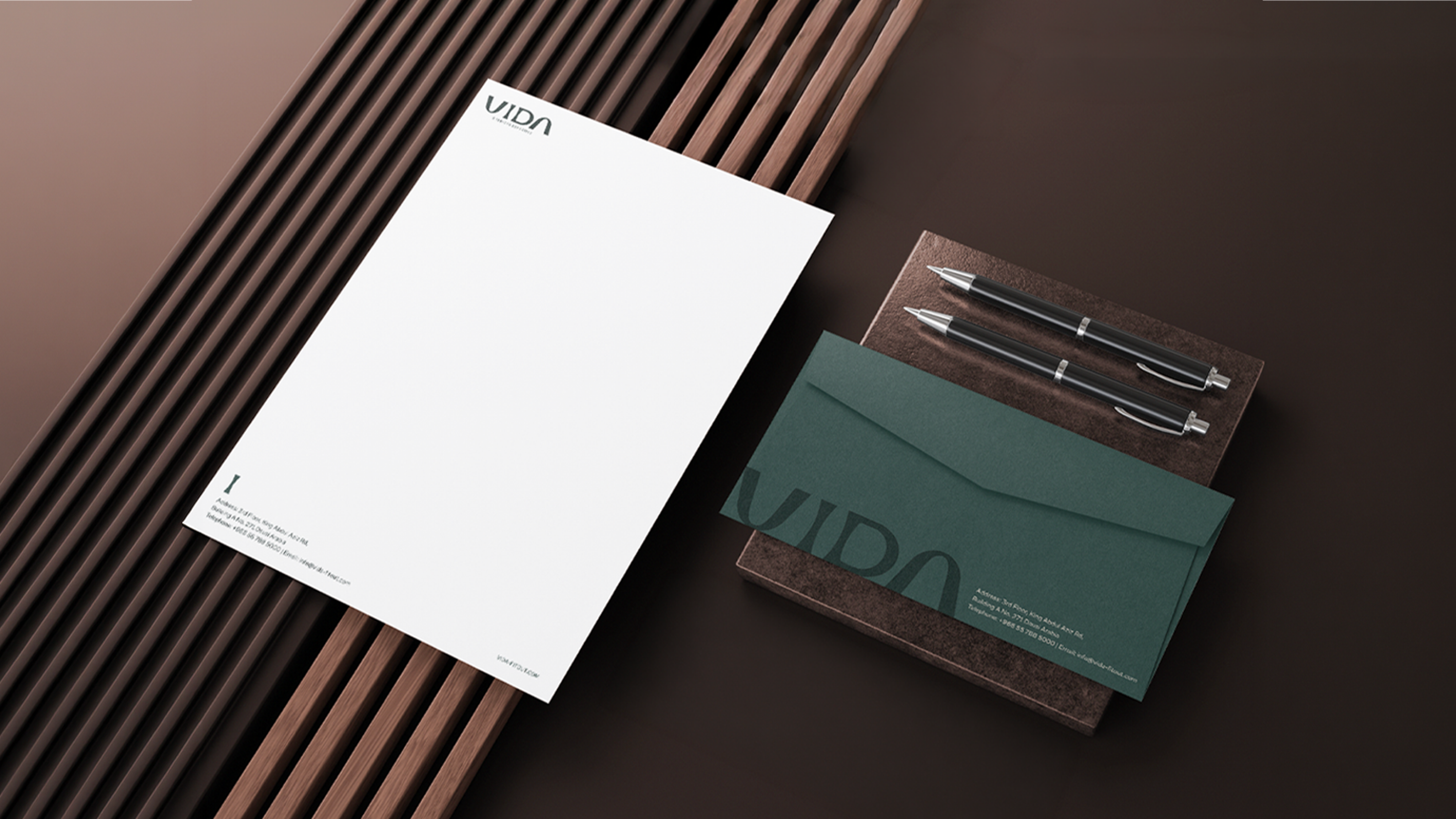
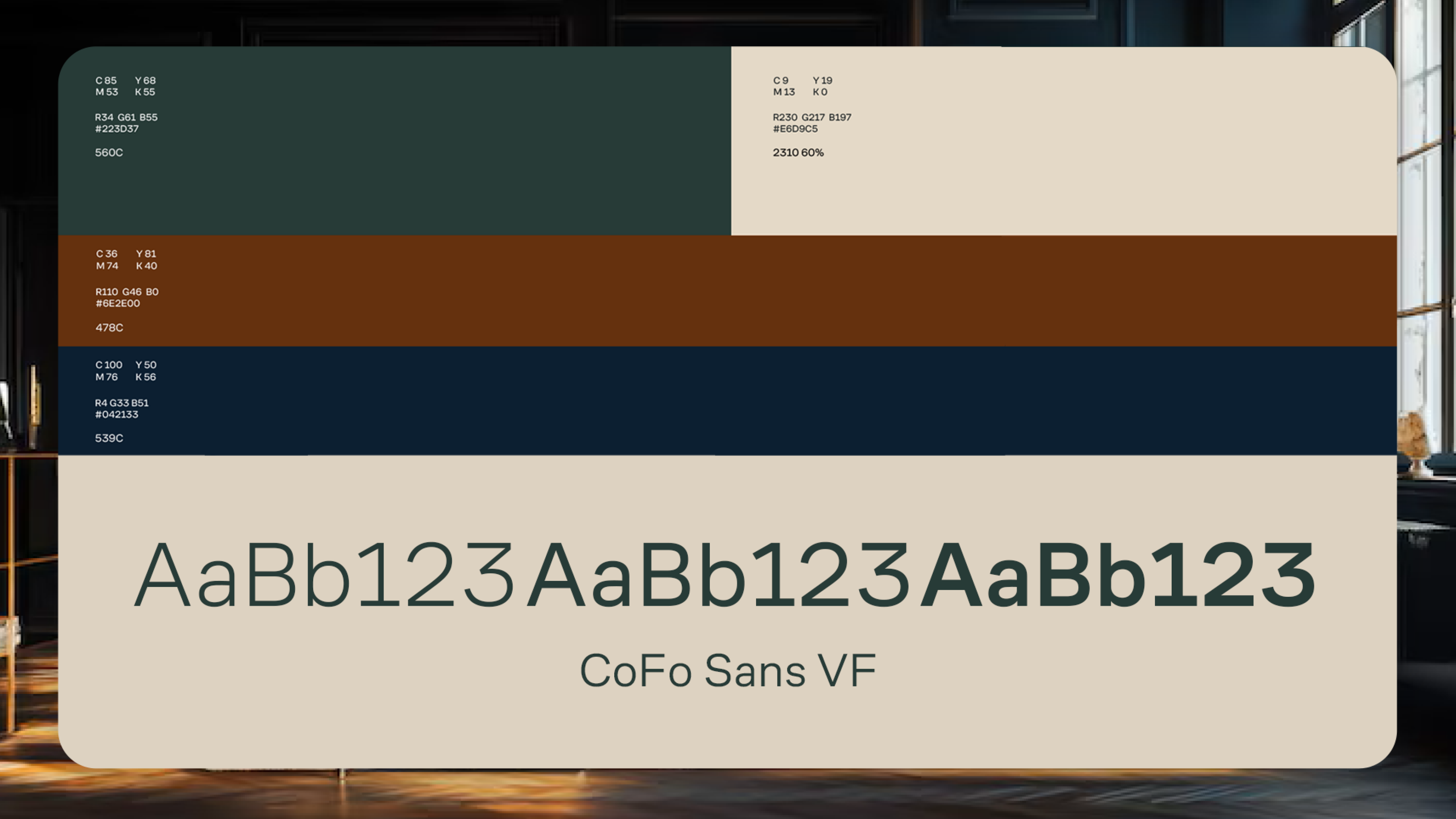
The visual identity extends beyond the logo. A restrained color palette of deep green, warm neutrals, and soft beige reinforces a sense of sophistication and understated luxury, while the carefully selected typography complements the logotype with clarity and elegance. Together, these elements create a cohesive visual language that is minimal yet expressive, allowing the brand to stand confidently across every touchpoint—from corporate collateral to digital platforms.


- Collaborators
Elyan Jabre (Creative Director)
Christine Hajjar (Head of Design)
Elyse Fata (Graphic Designer)
Tala Kassab (Graphic Designer)