case study
Shogun To Go
Strategy
Web Design & Development
Design
Branding
A New F&B Brand Came to Life
A fun branding and packaging project came our way when the renowned Shogun created a sub-entity called Shogun To Go.
The logo of Shogun To Go was adapted from the recently revamped Shogun logo (which was created internally by Shogun).
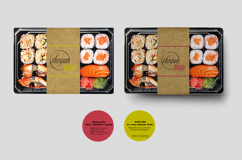
Our mandate was to take this logo and develop a whole universe around it that would best serve the delivery and take-away segment; this included a delivery menu, packaging collaterals and a website.
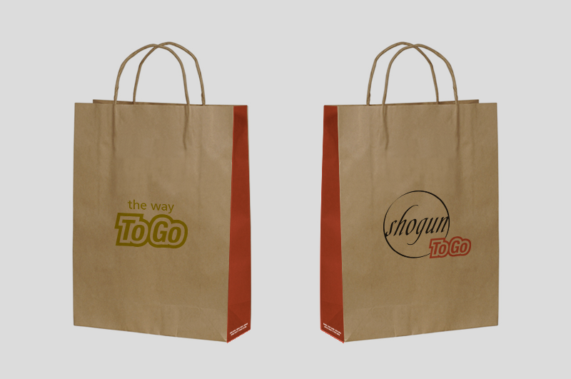
The first call to action was to work on the fun side of the brand by taking it in a different direction than the upscale Shogun, while respecting its roots and commitment to quality. This manifested itself in 2 ways:
1) The usage of vibrant colors that are directly inspired by the colors of sushi & wasabi
2)The play on the "To Go" element, making it a dominant part of the brand's look, but equally of its tone of voice
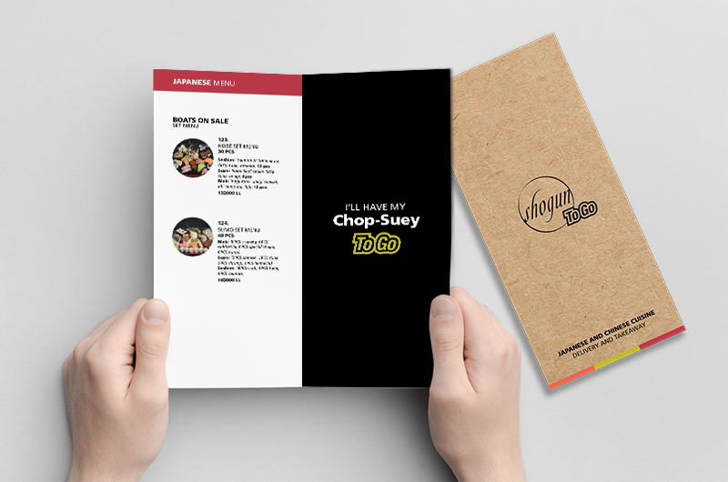
Then came the menu, which used the same color coding to distinguish between the different sections as well as the newly established fun tone of voice.
And finally, a colorful and vibrant website saw the light, where customers can order online and download the menu.
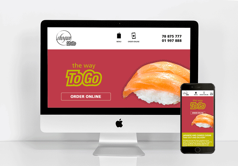
Learn more about this exciting new brand by visiting its website at shoguntogo.com.
- Collaborators
- Katia Barakat (Marketing Strategy)
- Elyan Jabre (Branding & Design Strategy)